We design SaaS platforms, web applications and digital products—product strategy, UX and UI, prototyping and design systems. Because we engineer what we design, the work accounts for the states, edge cases and trade-offs that decide whether an interface survives contact with the build.
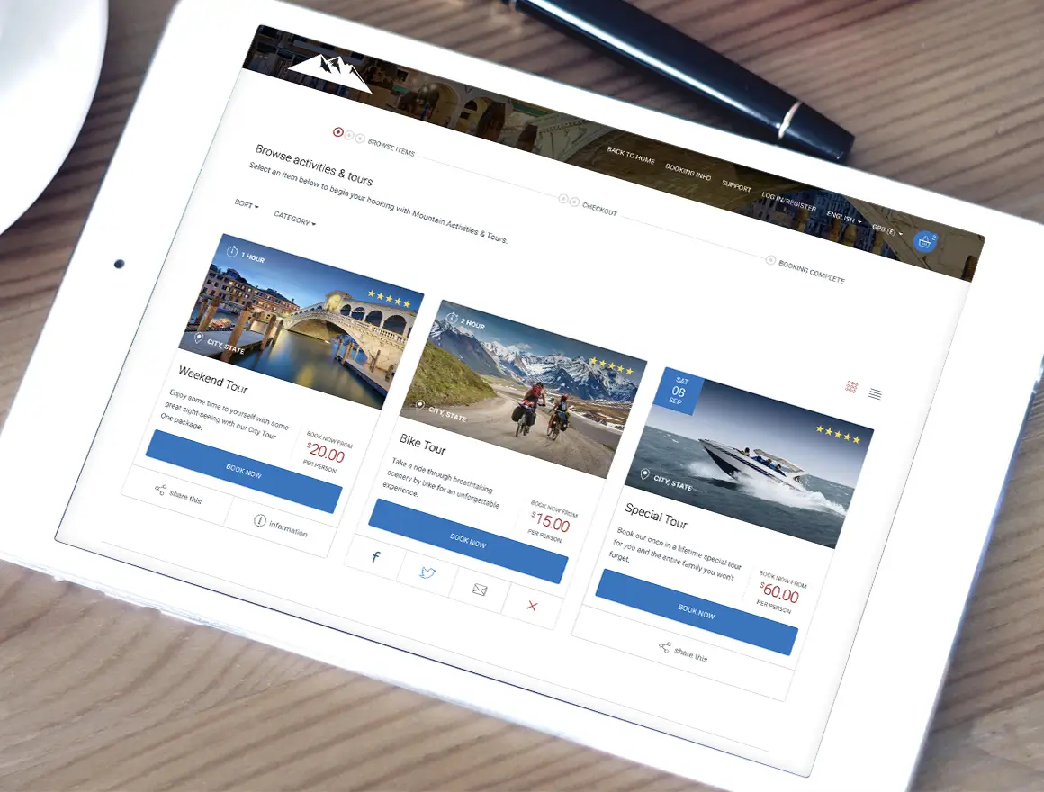
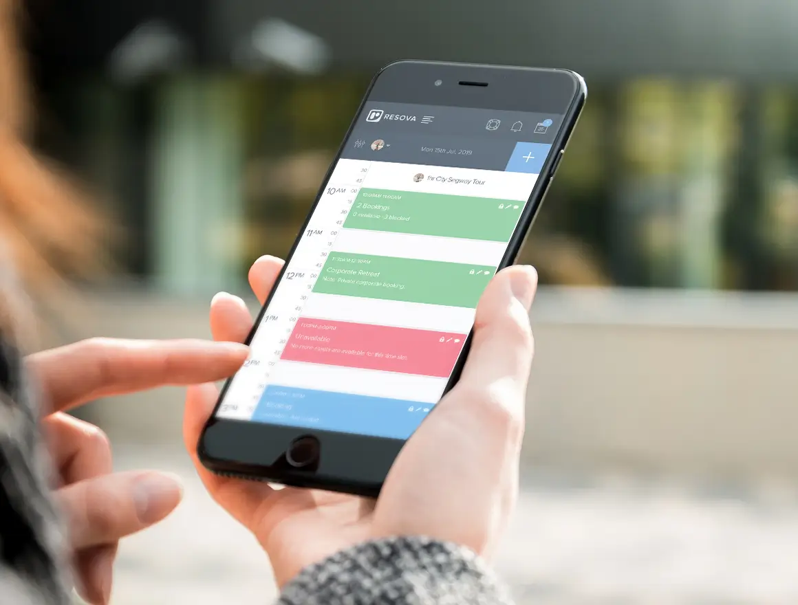
We designed both sides of Resova—a guest checkout used on phones and an operator back office used all day—for 1,000+ venues in 20+ countries.
Designing a website is largely about a message: hierarchy, brand, persuasion, someone who arrives, reads and acts. Designing a product is about the work people do inside it—often every day, often for hours, usually under mild time pressure.
That shifts where the effort goes. Most of the value in product design sits in structure and sequence rather than surface: what the screen is for, what someone is trying to finish, what they need in front of them at that moment and what is noise. It also sits in the unglamorous states nobody puts in a pitch—an empty account on day one, a permission-denied message, a long list with no results, a failed payment, a field with forty characters of client name in it. Those are the screens people actually meet, and they are where products either feel considered or feel unfinished.
The other difference is time. A product keeps growing, and every feature added to a design that has no system behind it makes the next one harder. Designing for year three—coherent components, predictable patterns, consistent language—costs very little at the start and is close to impossible to retrofit later.
What the product is for, who it's for, and what the first version has to prove. Design decisions are easy once those are settled and impossible while they aren't.
Information architecture, journeys and screen structure built around the tasks people repeat, not around the shape of the database behind them.
Interface design that carries your brand without getting in the way of the work—legible, consistent, and calm enough to sit in front of someone for eight hours.
Clickable prototypes of the journeys that matter, so the product can be used and tested while changes still cost hours rather than weeks.
Components, states, spacing and language agreed once, so the fifteenth screen behaves like the first and the product stays coherent as it grows.
Whether we engineer it or your team does, the handoff includes the behaviour and the awkward states—not just the screens that look good in a presentation.
Four stages, though the last one never really finishes while the product is alive.
The users, the job they repeat, the commercial model, and where the current process—or current product—loses them.
Journeys, information architecture and screen structure, agreed in low fidelity before anything gets styled.
Clickable journeys in front of real people, and the changes that come out of watching them use it.
Interface design, the states around it, and a system that keeps the next twenty screens consistent.
Resova is the clearest illustration of what product design has to hold together, because it served two groups who wanted almost opposite things. Guests booking an activity wanted to be finished—on a phone, in a few taps, with no account and no learning curve. Venue operators wanted density: schedules, availability, staff, payments and reporting available at a glance, all day, often while talking to a customer.
Those two requirements pull in different directions, and you can't split the difference. So we designed them as two experiences on one platform: a checkout stripped to the minimum and optimised relentlessly for completion, and a back office designed around the handful of things staff do hundreds of times a day. We ran discovery with both groups before designing either, and prototyped both journeys before any of it was engineered.
A different kind of constraint shaped The Pavilion Project, whose audience is adults with learning disabilities. Accessibility there wasn't a compliance exercise—it decided the language, the structure, the imagery and the interaction design from the first sketch. It's still serving the organisation a decade on.
See the case studies
Every screen has more versions than the one in the presentation. Empty on day one, loading, mid-error, permission-denied, no search results, one item, four hundred items, a name that's twice as long as the column allows. Designing these is unglamorous and it's most of what separates software that feels considered from software that feels like a demo. We specify them, because if we don't, someone will improvise them at the end of the build.
Operational interfaces need a lot on screen—that's the job. The skill isn't reducing what's there, it's ordering it: what has to be visible, what can be one interaction away, what earns its place through frequency of use rather than seniority of the person who requested it. Get this wrong and people build their own workarounds, usually in a spreadsheet, which is where most software goes to be ignored.
Labels, buttons, empty states and error messages are design decisions, not copy to be filled in later. The words determine whether someone understands what will happen before they click, and whether an error tells them what to do or just that something went wrong. Consistent product language also does quiet work in support tickets: people can describe what they did because the product gave them the words.
A design that can't be built efficiently isn't finished, and one that ignores how data actually arrives will fall apart on real content. Because we engineer as well as design, the trade-offs get made early by people who understand both costs—which tends to mean fewer surprises during the build and fewer compromises invented under time pressure at the end of it.
You have engineering capability and need the product designed. The handoff is the deliverable, so it includes behaviour, states and a system your team can build against consistently.
We're engineers too, so the questions your developers will ask are the ones we've already answered—and we stay available through the build rather than leaving a document to interpret.
One team from discovery to launch. Nothing is lost in a handover, and the decisions made in design are made by people who'll live with their engineering consequences.
This is how most of our work runs—see SaaS development and web app development.
The product works and has customers, but has gained features faster than structure. It's become hard to learn, and every addition makes it worse.
We work out where people actually struggle, then improve it in a sequence that keeps a live product earning—rather than stopping everything for a redesign.
Web design is largely about presenting a message: hierarchy, brand, persuasion, a visitor who arrives, reads and acts. Product design is about the work someone does inside software, often daily and often for hours. It deals with state, permissions, error cases, empty screens, dense data and workflows that have to stay coherent as features accumulate over years. The visual craft overlaps, but the thinking is different: a product designer spends most of their time on structure, sequence and edge cases rather than on the impression the page makes in the first five seconds.
Yes, and we do it regularly. In that case the handoff is the deliverable, so we treat it seriously: prototypes that show real behaviour rather than static screens, the states nobody remembers to specify—loading, empty, error, permission-denied, long content, no results—and a design system your developers can build against consistently. We are engineers as well as designers, so the questions your team will ask are the ones we have already answered. Where it helps, we stay available through the build to make decisions as they come up rather than leaving a document to interpret.
Often, yes—it is one of the more common reasons people come to us. The typical situation is a product that works and has customers, but has accumulated features faster than structure, so the interface has become hard to learn and slow to change. We start by understanding what people actually do with it and where they struggle, then propose a sequence of improvements rather than a single dramatic redesign, so a live product keeps working while it gets better. A full visual refresh is sometimes the right call, but it is rarely the most valuable first move.
We prototype. Not static mockups but clickable prototypes of the journeys that matter, which you and—ideally—a few real users can use before anything is engineered. That is the cheapest moment to discover a workflow does not match how the job is actually done. It is also the most useful artefact for a board or an investor, because people respond far better to something they can click through than to a description of it. Nothing guarantees a design is right, but testing it while changes cost hours instead of weeks is the closest you get.
If the product will keep growing, yes—though it does not have to be elaborate. A design system is really an agreement about components, spacing, states and language, so the fifteenth screen looks and behaves like the first and nobody re-decides what a button or a table row should be every time. For a small first release we keep it lightweight and extend it as the product grows. For a platform with several user types and a long roadmap, it is the difference between a product that stays coherent and one that gradually becomes fifteen different products in one interface.
Yes, and it is part of the design work rather than a pass at the end. That means sensible colour contrast, keyboard navigation, clear focus states, labelled form fields, semantic structure and interfaces that make sense to a screen reader. We built a fully accessible site for The Pavilion Project, whose users are adults with learning disabilities, so we have designed for genuinely demanding accessibility requirements rather than only for a checklist. If you have a specific standard to meet, tell us early and we will design to it.
Less than people fear for a first release, and more than people expect for a mature platform. A tightly scoped MVP with one core journey needs the journey designed properly and not much else—design that goes wider than the build is waste. A platform with several user types, dense reporting and a back office needs considerably more, because the cost of an incoherent interface compounds with every feature. We would rather size the design work to the release than sell a fixed package that fits neither case.
Yes, when you want us to. It is the main reason clients come to us rather than to a design studio and a development shop separately. Design decisions made without engineering input tend to be expensive or quietly impossible, and engineering decisions made without design input tend to show up in the interface. Keeping both in one team means the trade-offs get made by people who understand both sides, and nothing is lost in a handover. If you only need the design, that is fine too—see the handoff answer above.
Whether it's a new product to design from scratch, an interface that's grown unwieldy, or a design your own developers will build, we'd like to see it. The first conversation is about the work your users are trying to finish.
Discuss your productPrefer email? hello@walkerthomason.com